CGM INTERNSHIP
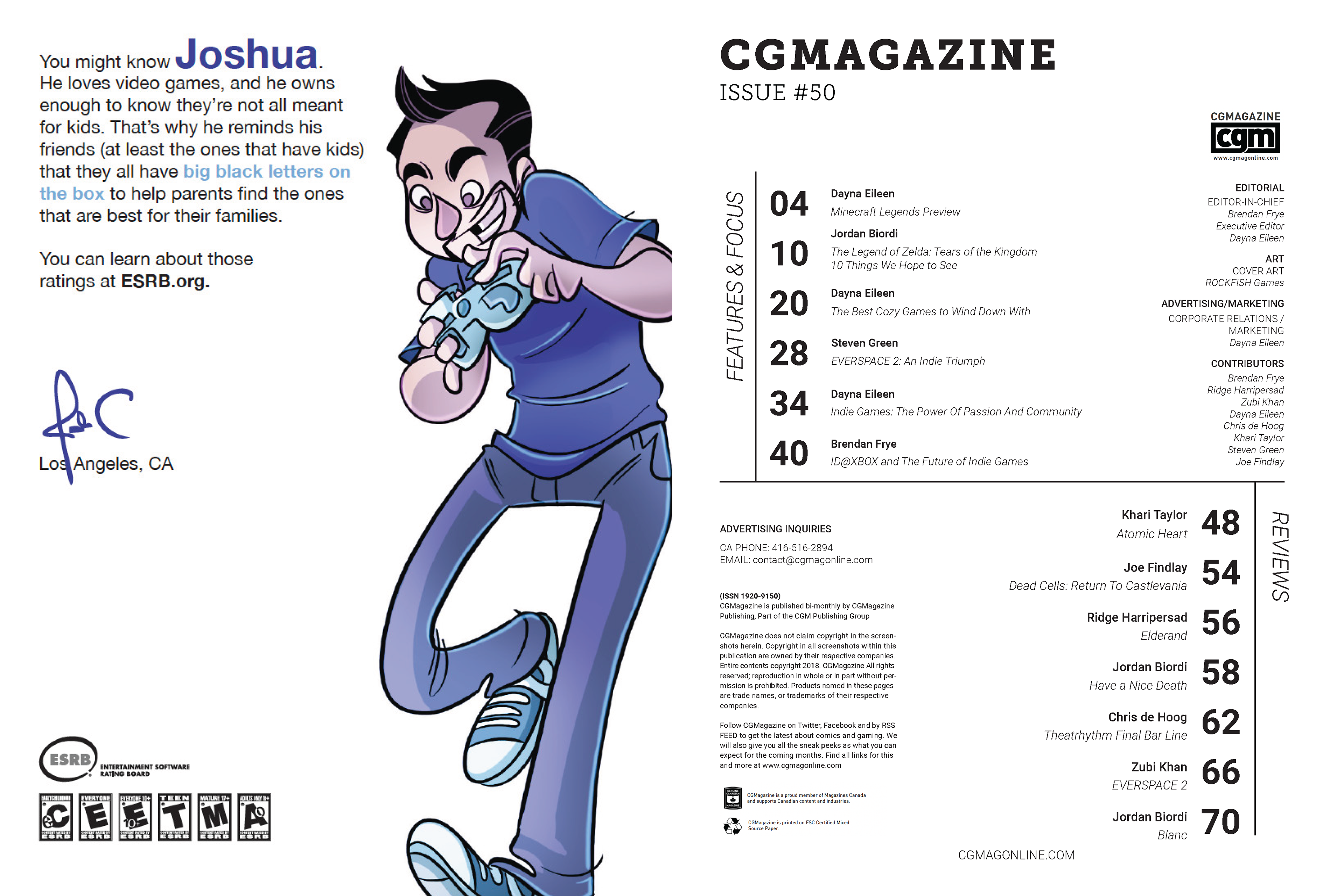
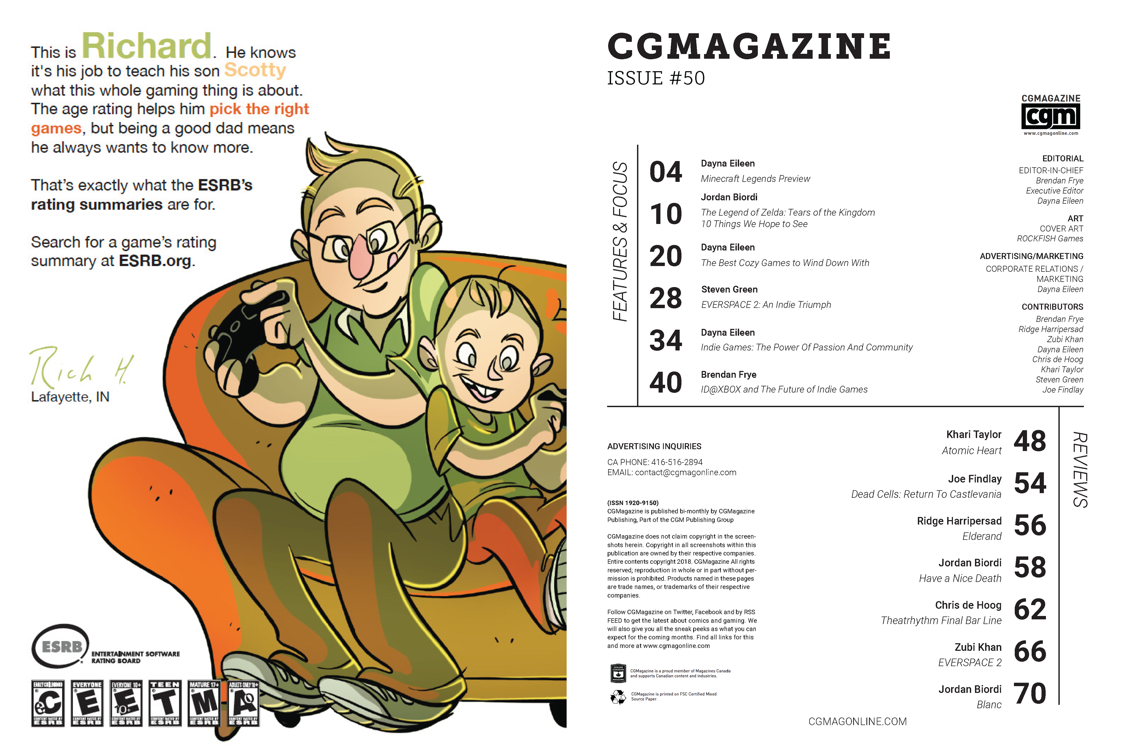
Throughout the internship at CGM, I worked on 3 different tasks. The first task was re-designing the table-of-content page for the CGM magazine. The goal was creating a dynamic spread without looking too clustered. This was challenging as I wanted to create contrast between font sizes with negative space, but there were so many required texts that there were not enough room for that exploration. However, I was still able to create size contrast between the page number, author’s name, and article name to create more intriguing layout.
The second task was creating an ad page about CGM Online, which will be placed in the magazine. The point was to make the reader intrigued about the website, not just the magazine. I have added a series of thumbnails of game/movie/comic review articles, which is placed between black spotlight effect background. The spotlight effect leads the eyes to the CGM logo, and than the CG Magazine online title.
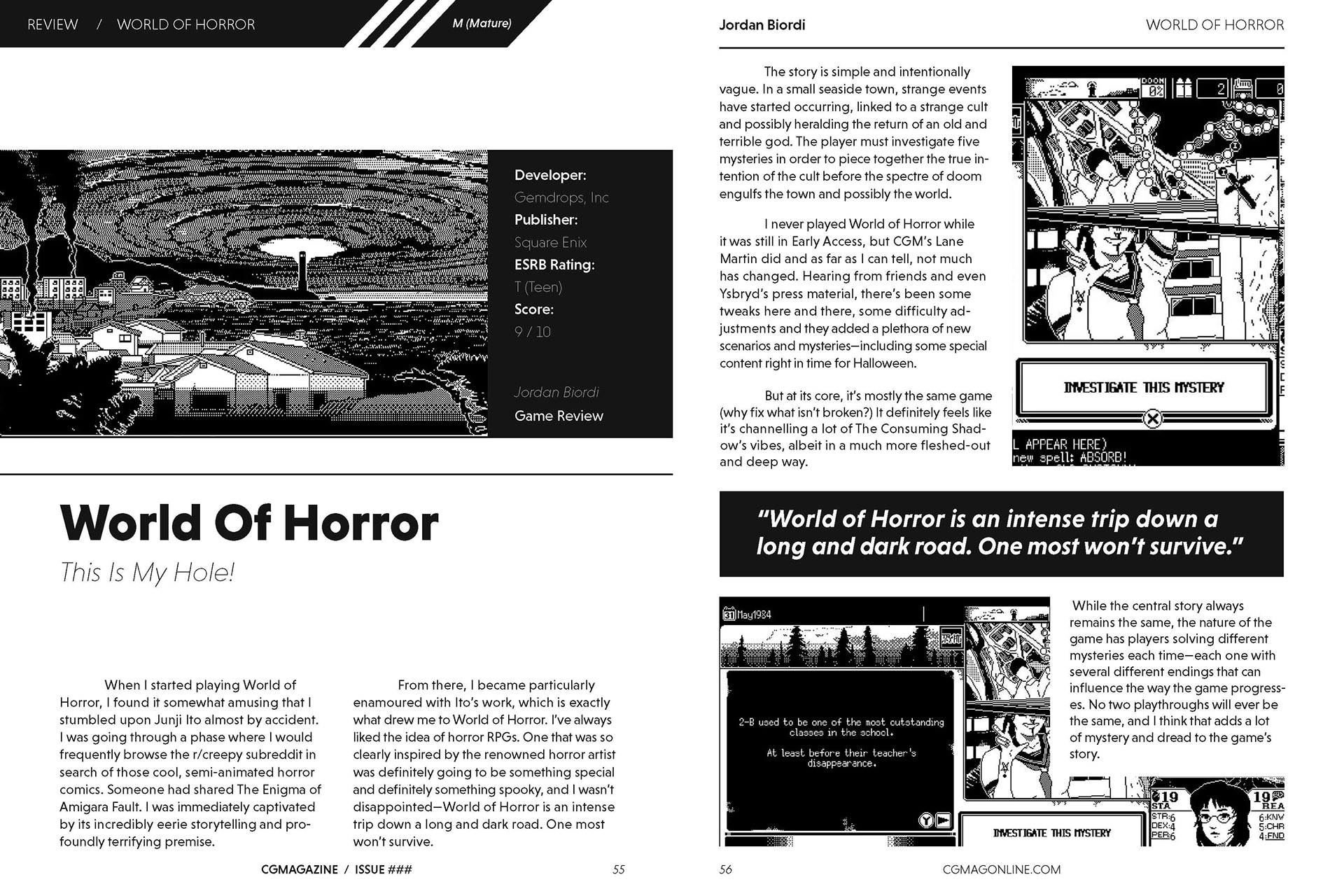
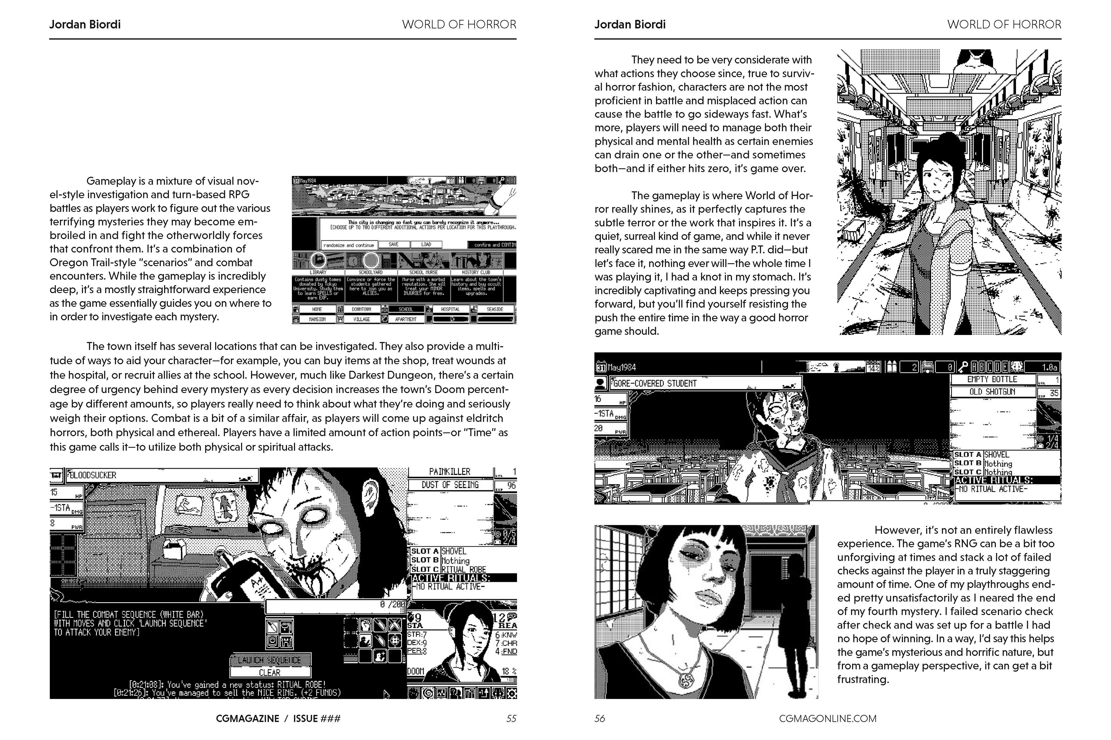
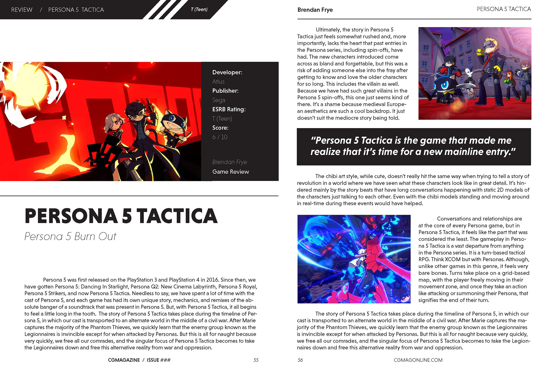
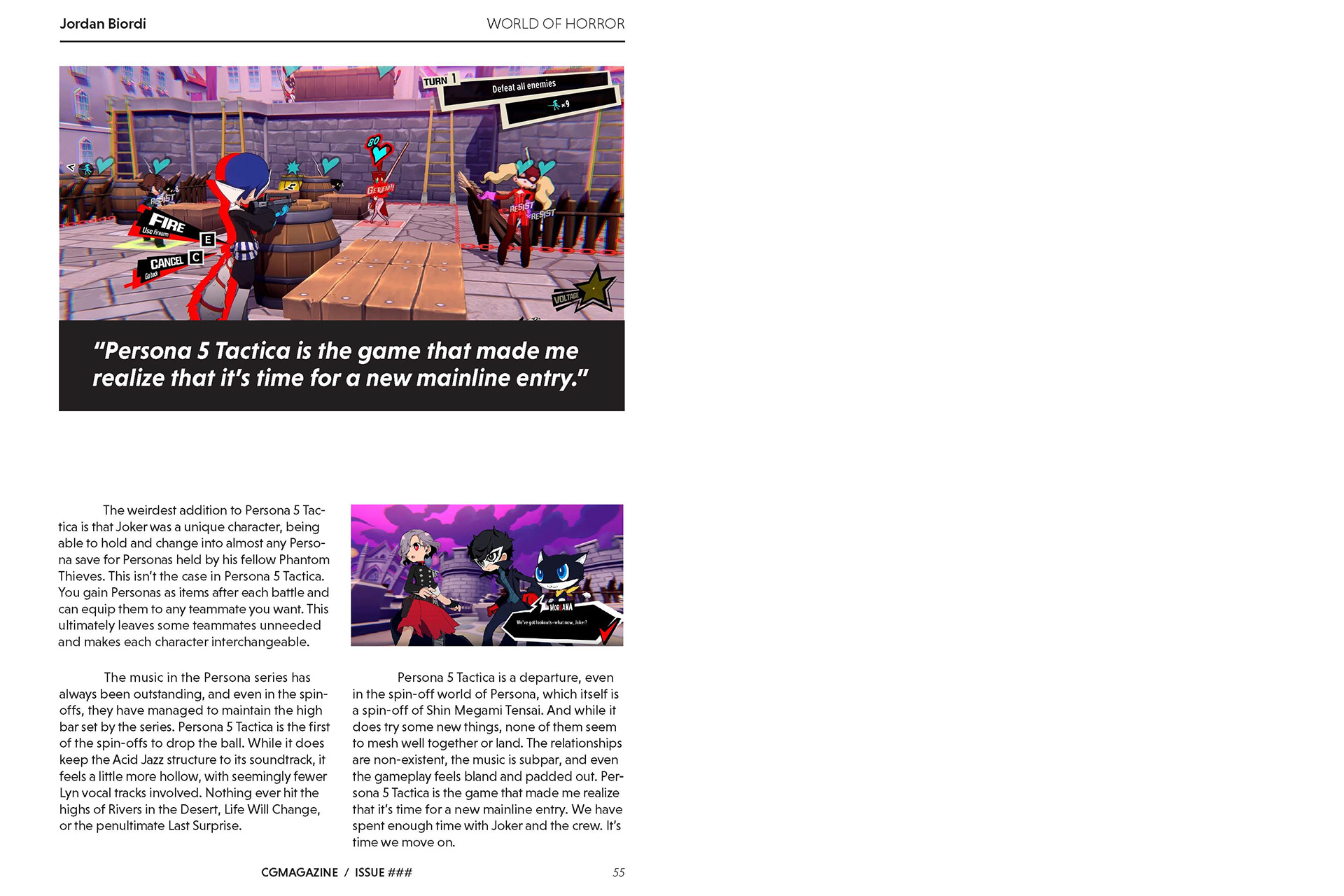
The third task was re-designing the game/movie/cartoon review article section in the magazine. CGM had the traditional 2 column structure through out their magazine. So, I tried to make it more exciting by adding quotes that break up the 2-column structure, and also adding photos in a way where it breaks-up the heavy text boxes.
