RESEARCH & PROCESS BOOKLET: https://drive.google.com/file/d/126yhFxUrrlgj2D_zj67zfmc6Jk0iL8xv/view?usp=sharing
REDESIGNING PORTMEIRION PACKAGING WITH WINDOWS/REVEALS
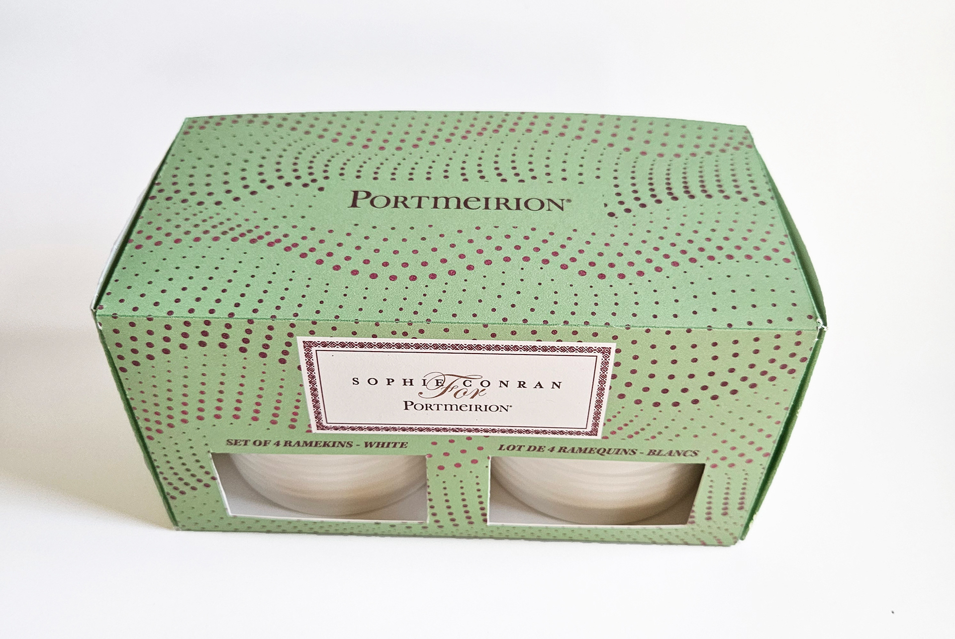
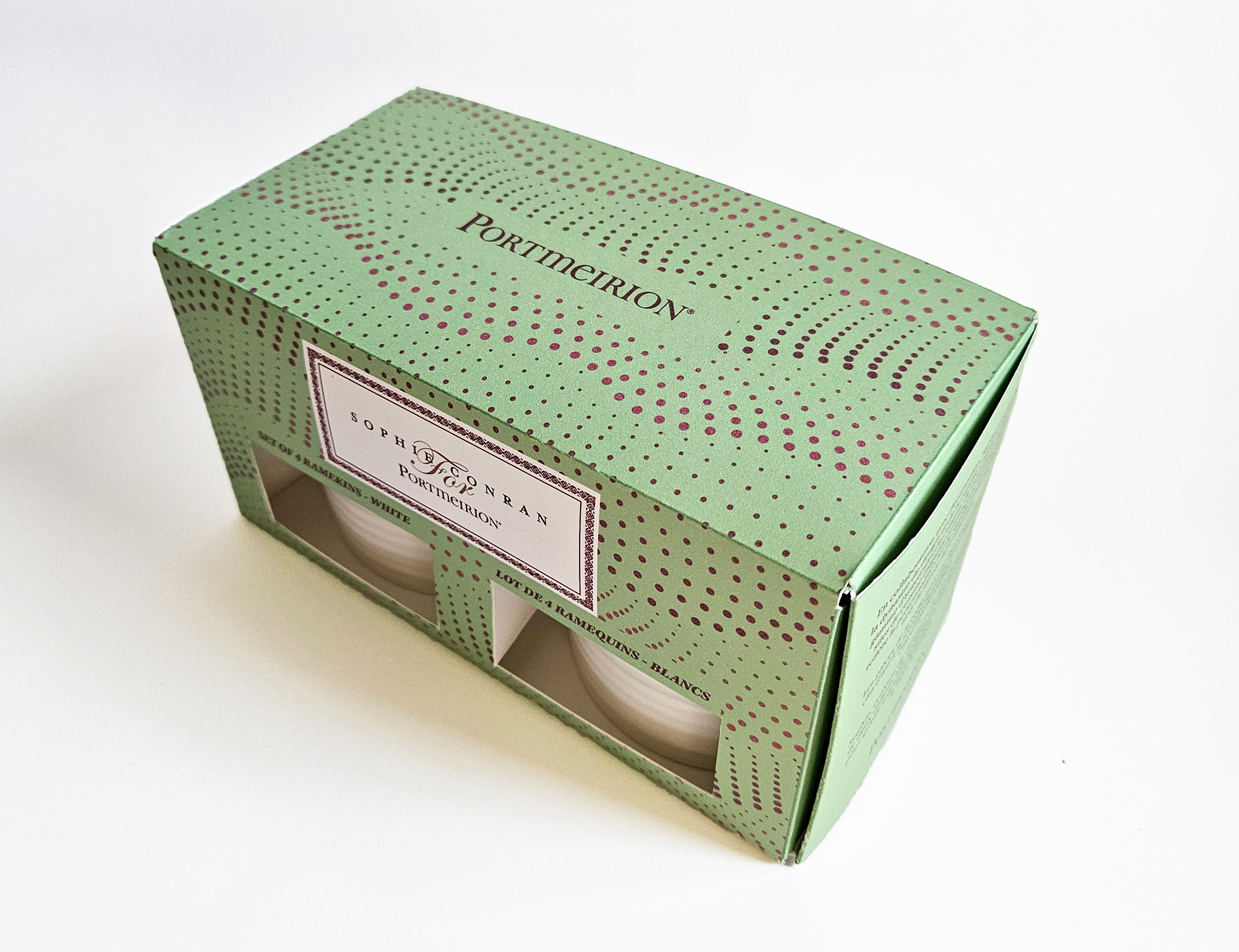
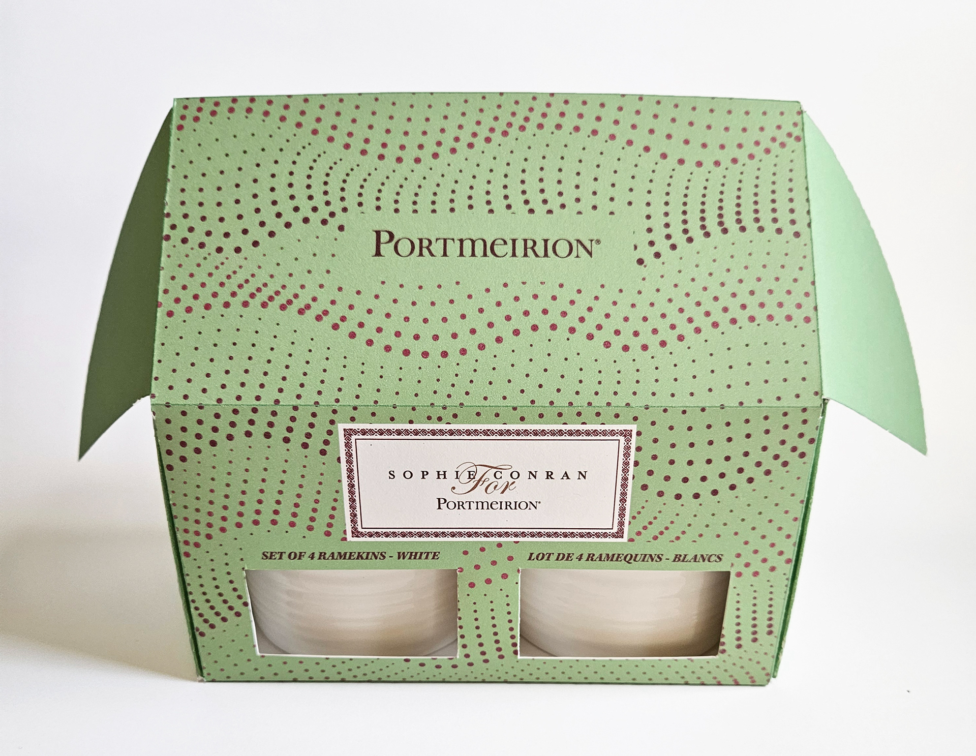
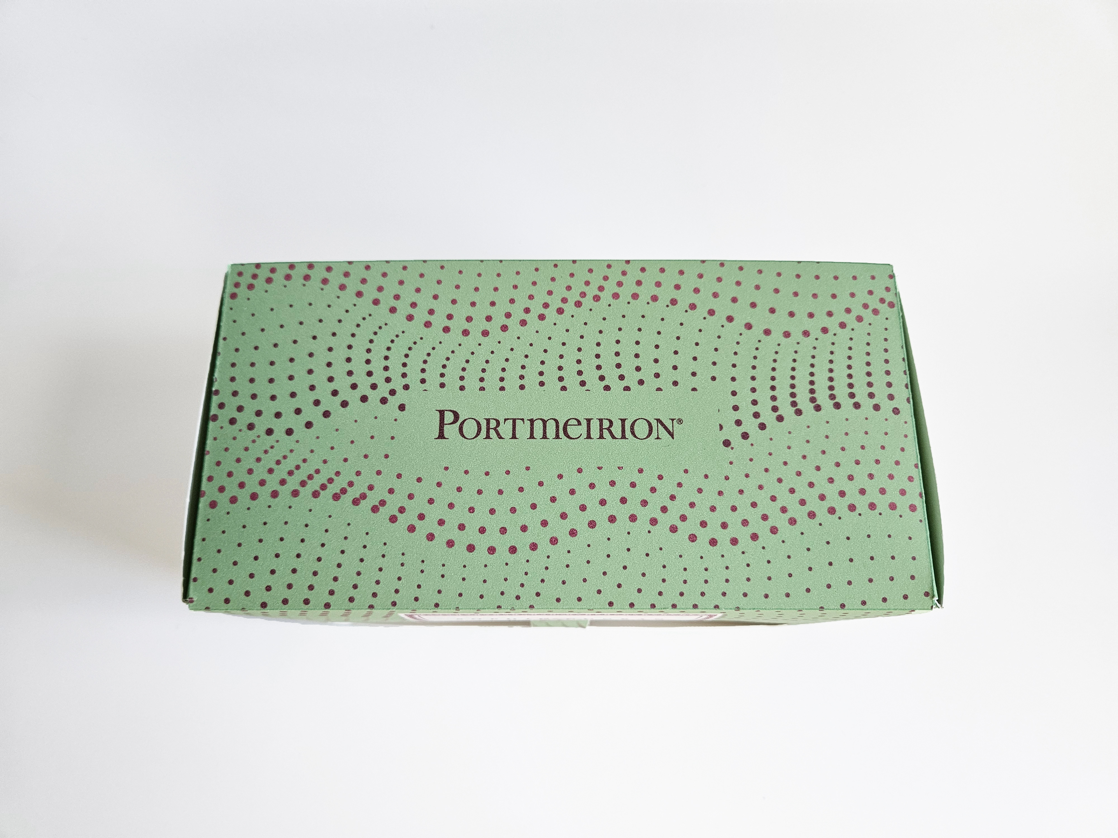
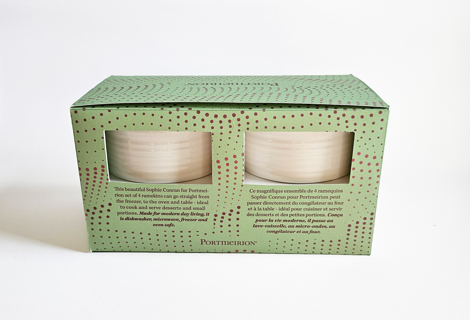
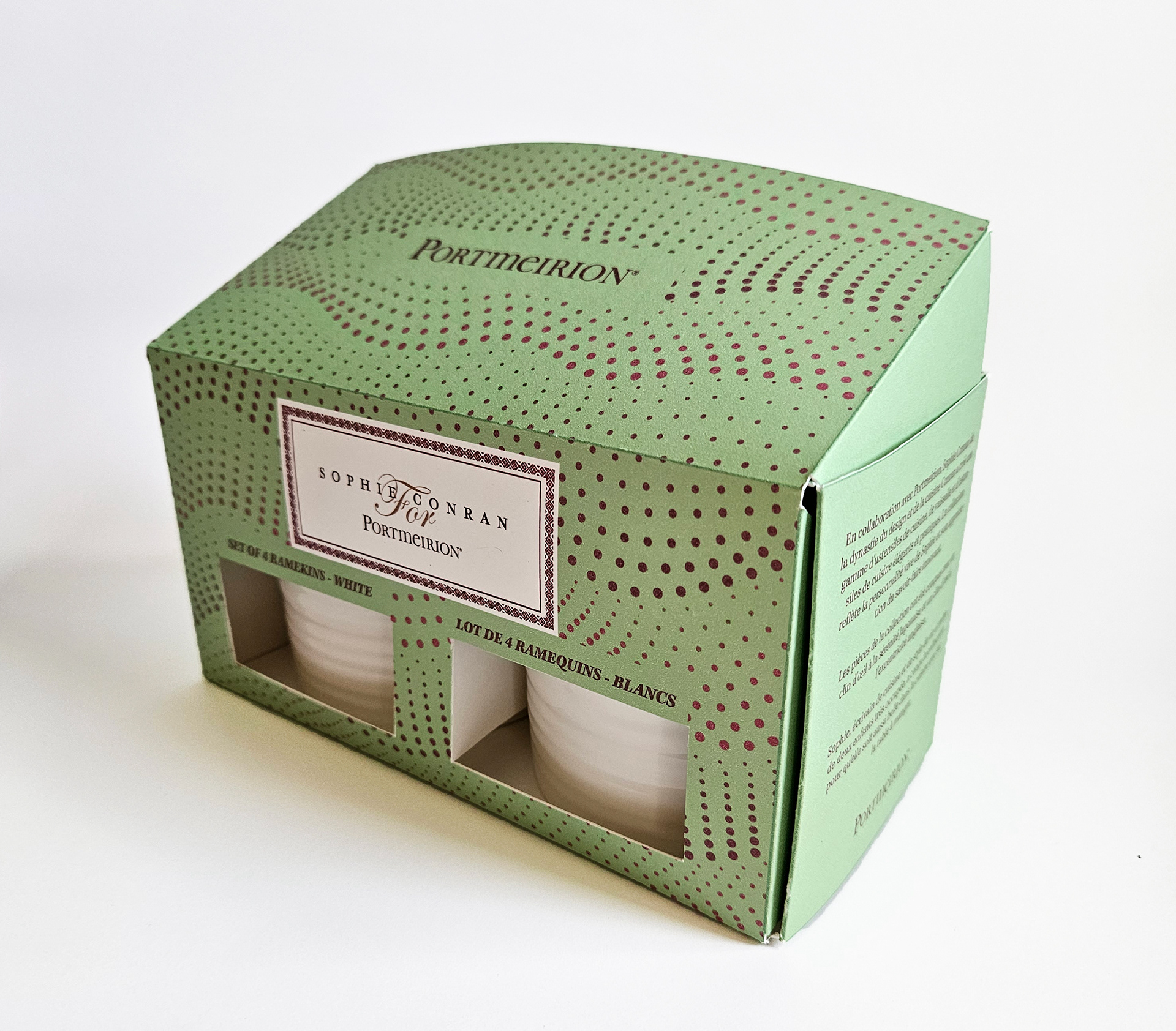
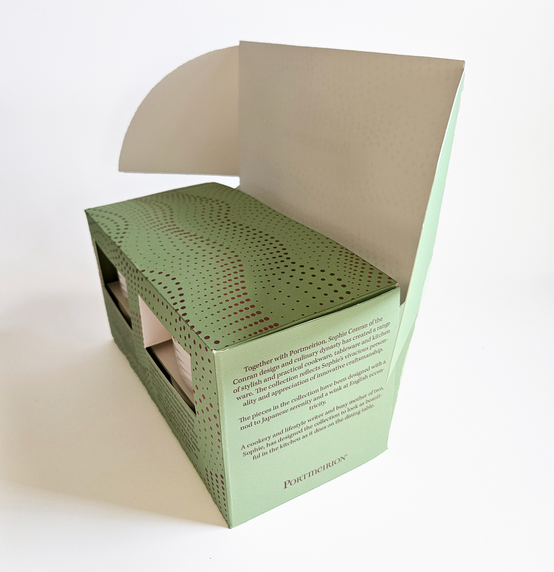
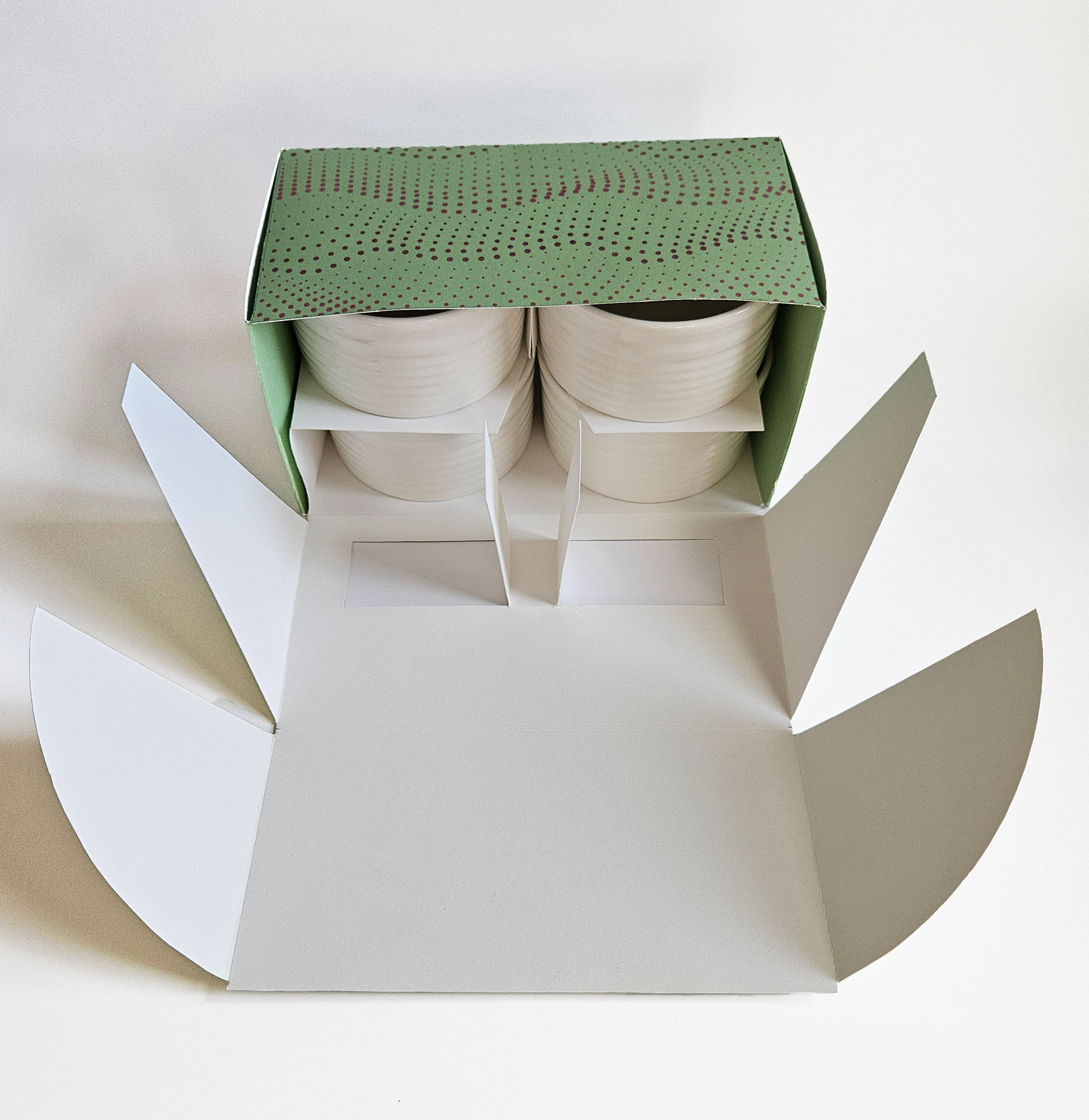
The primary goal for redesigning the package for this Portmeirion ramekin is to create a reveal/window where the consumer could see part of the product to gain more understanding and interest - especially as this product have tactile pattern. I have created 4 windows, 2 on the front and 2 on the back, where it shows all 4 ramekins. The cutouts for the windows weren't completely cut off. Instead, one side of the paper remained attached so the excess paper can secure the ramekins in place. Another goal for improvement was to create the packaging using only one material and the least amount of adhesive. I didn't use any adhesives and used card-stock paper and laser printed the pattern and colours on. Limiting to one material will make the recycling process much efficient, as there are no extra steps needed for separating layers. The last goal was to set some hierarchy to the visual elements on the package and make it informative yet clean and easy to read. The original packaging have the logo and the product name placed inside the same box, making it hard to distinguish each other. Instead, the name of the product is now placed on top of the window, so people could now see the name and the product at the same time. I have also added extra informations that are highlighted in their website product description.
