

TYPOGRAPHIC DIALOGUE
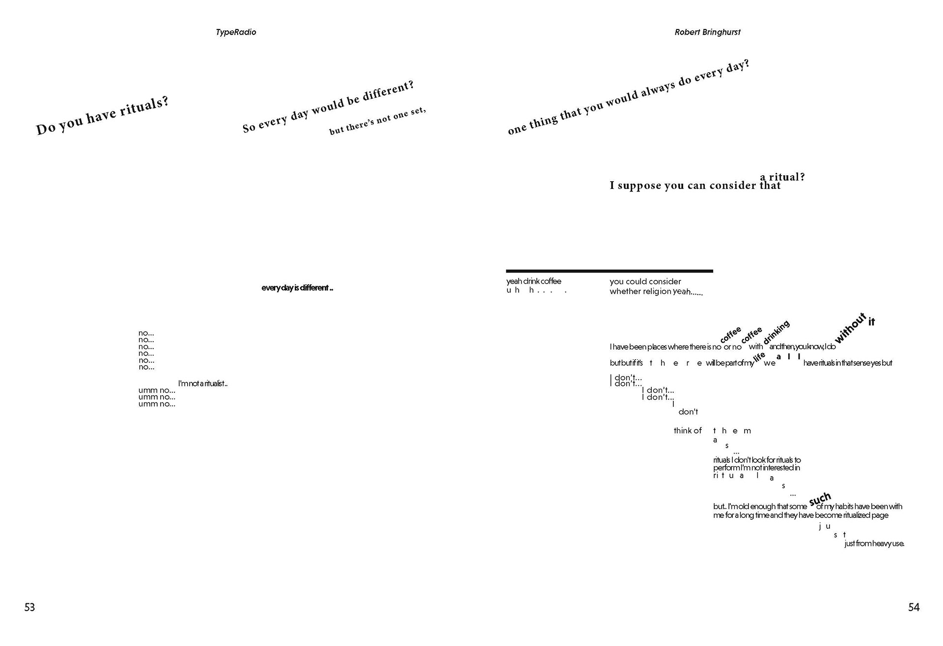
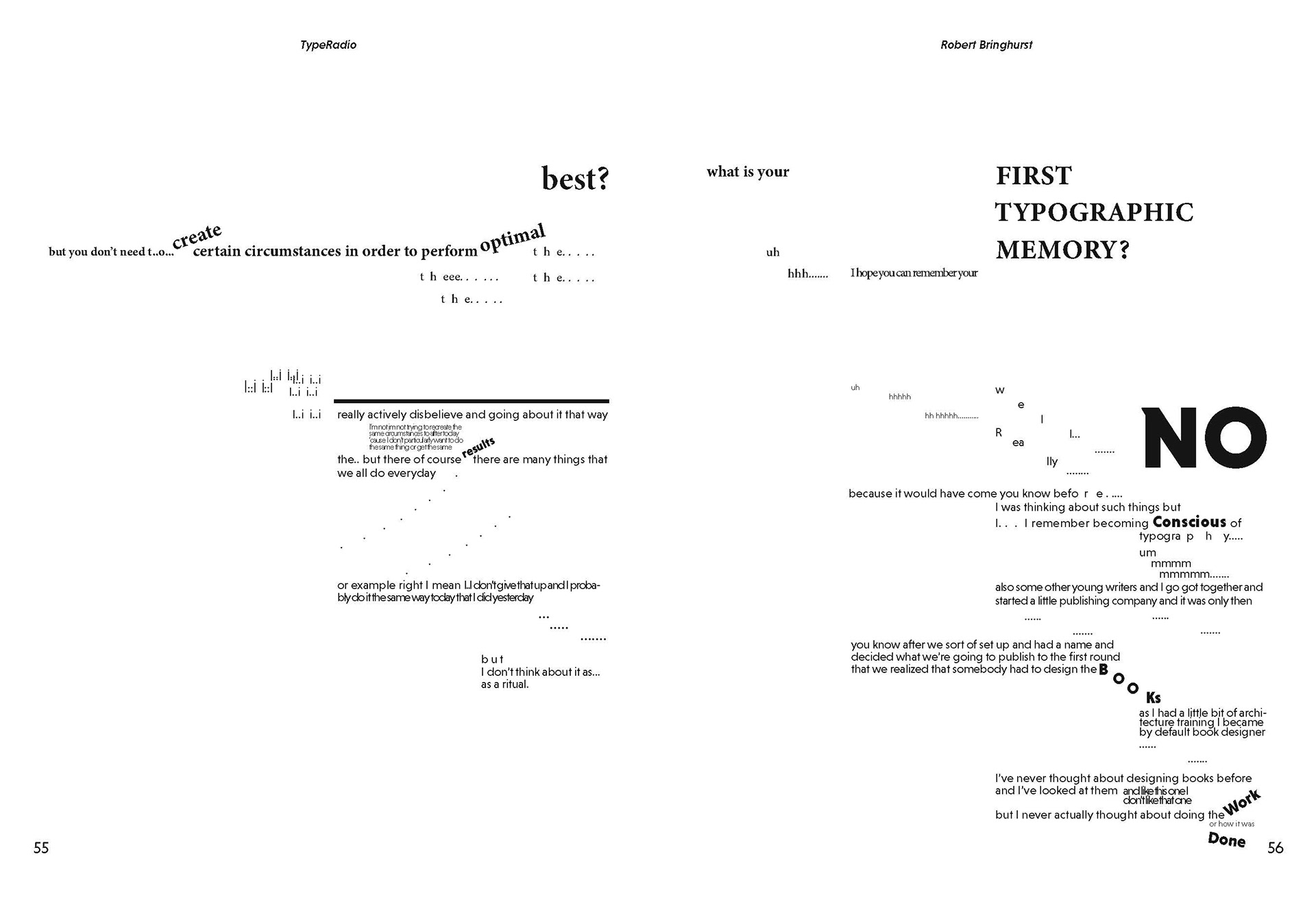
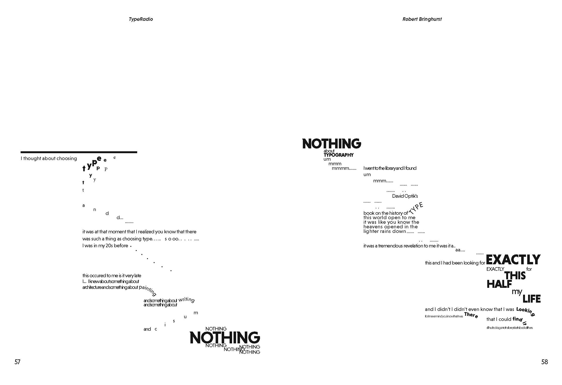
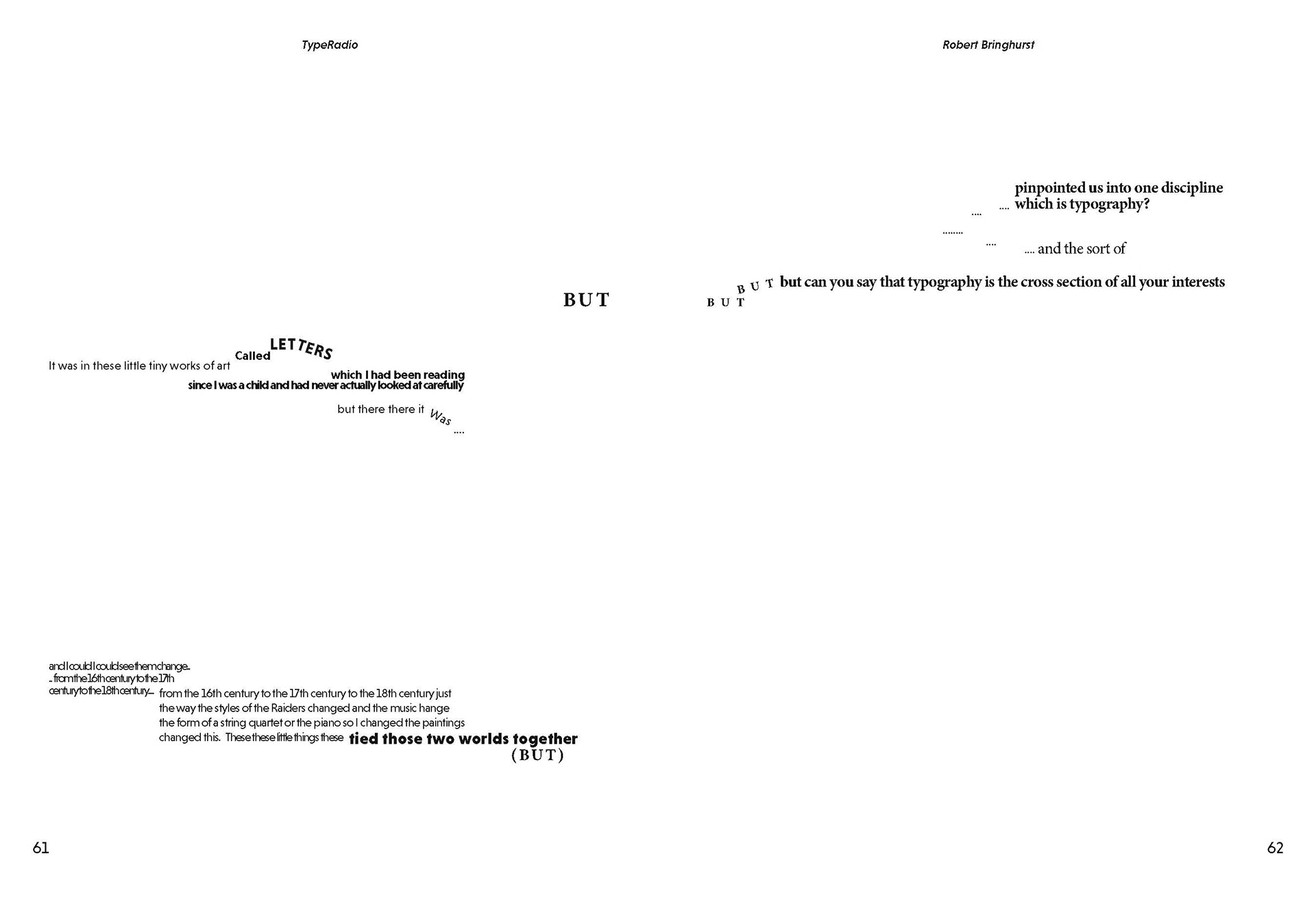
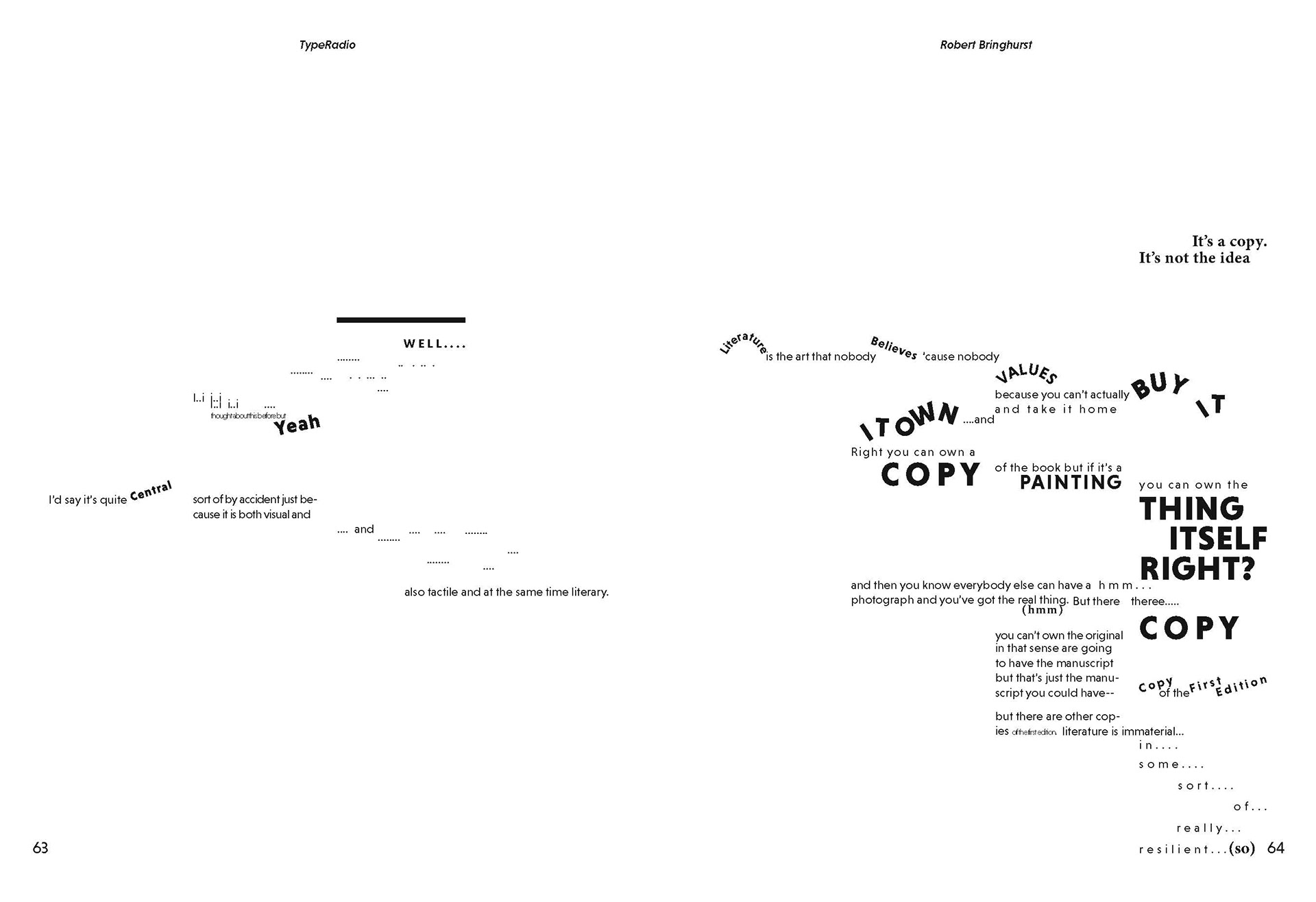
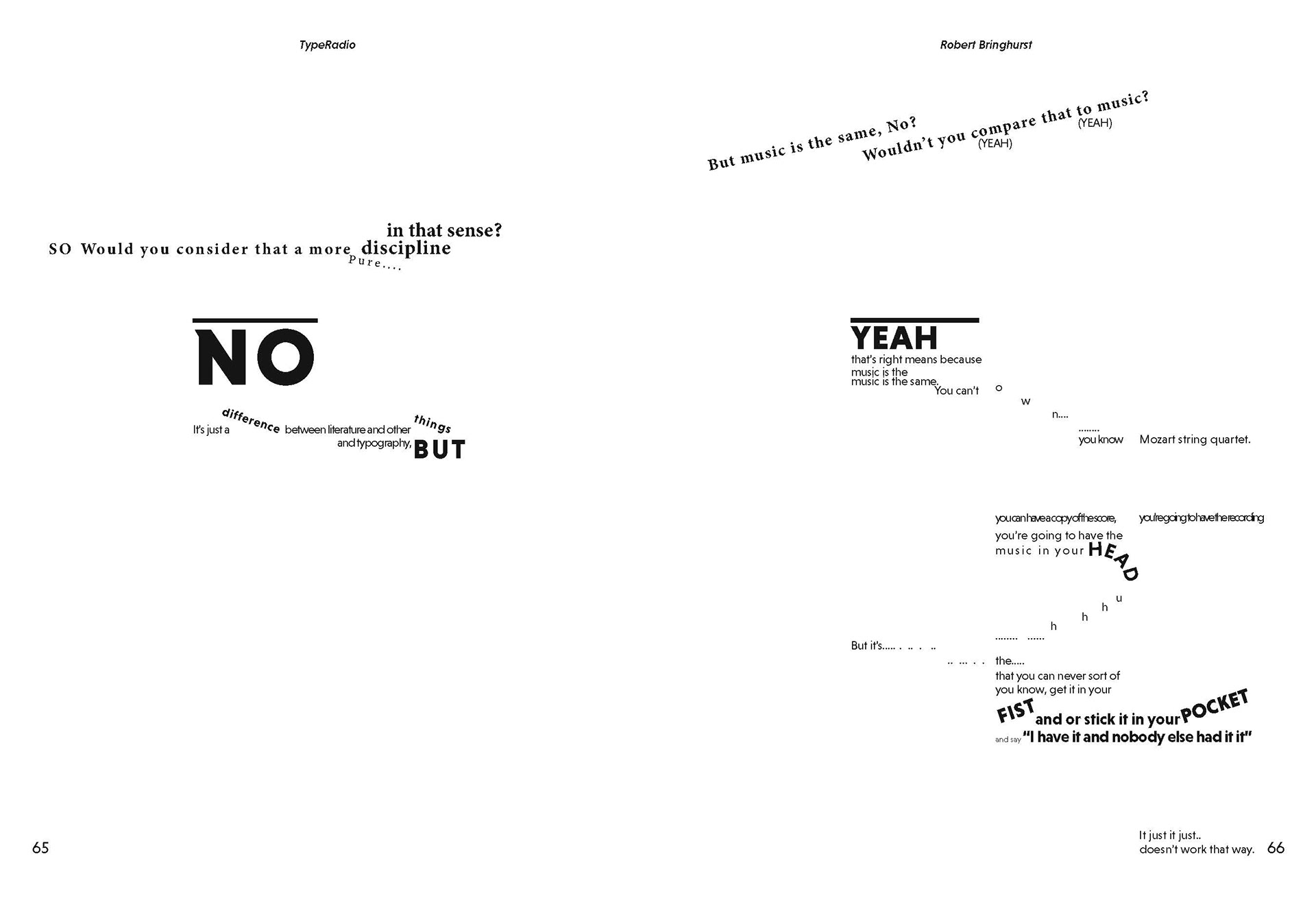
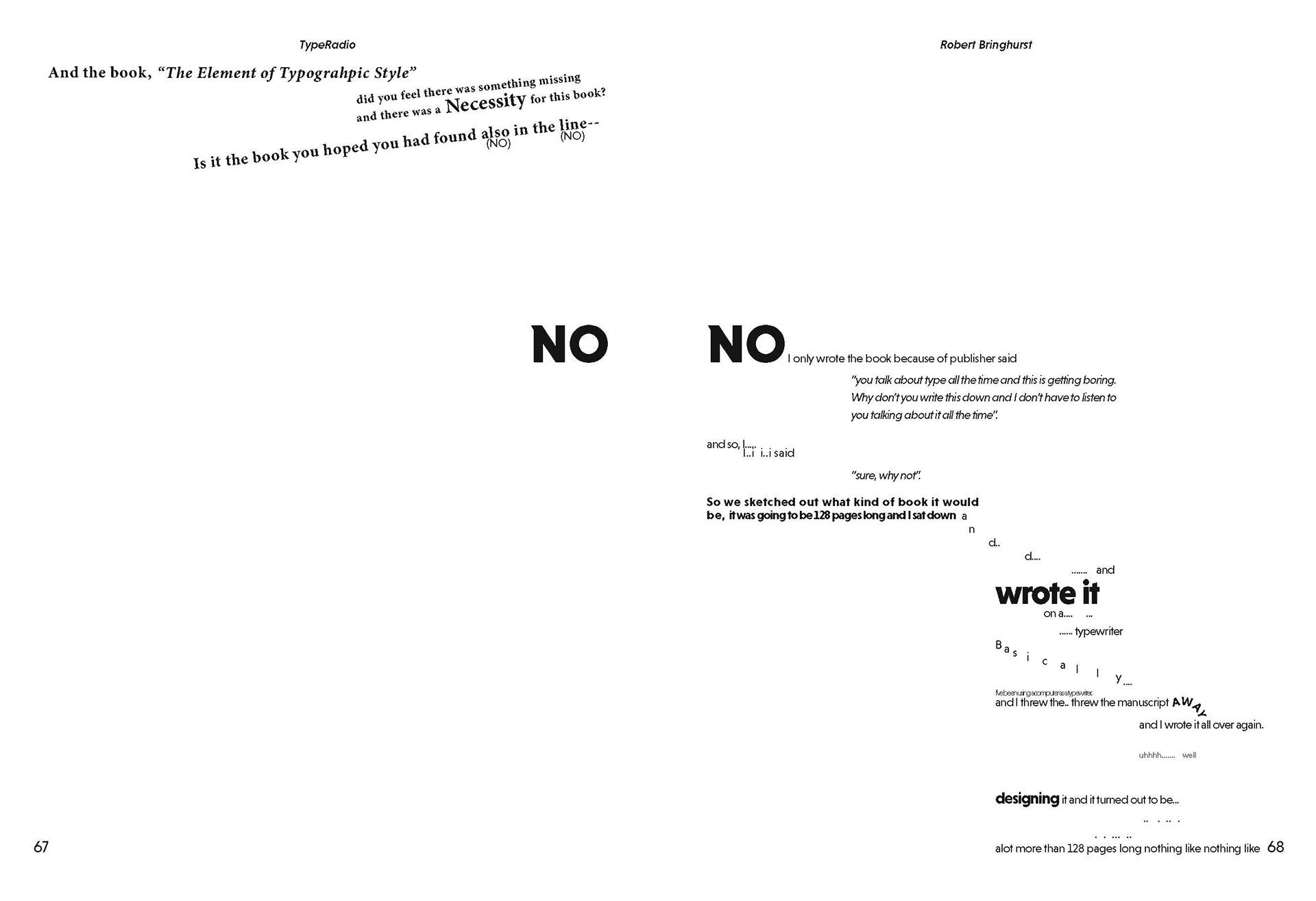
The purpose of this assignment was to translate an audio recording of a dialogue and turn it into a visual artifact. The objectives were to use topographic structures to control space, tempo, and sequence and to create the visual artifacts that express the nuance of auditory experiences(space, time, emotion and tone) . I’ve selected an audio of one interview from Typeradio. Ther interview was held by two interviewers, Liza and Donald, and the interviewee is Robert Bringhurst. Robert Bringhurst is an author and typographer whois known for his book “The Elements of Typographic Style”.
Some of the key elements from the audio was the monotone, quiet, and calm voice. There was limited emotion and the dialogue was long and continuous. To best depict these features, I used more organized, formal, and linear structure. The text boxes are arranged to create a rectangular/linear layout to visualize the interview. However, inside these formal layouts, there’s a more dynamic arrangement of words.
Serif type is used as main with some sans-serif type to highlight the monotone element and to differentiate between the interviewee and interviewers.
Tracking - used to describe how fast or slow the person is speaking.
Grid - 4 column and 3 row gird. The first row is assigned to the interviewer and the rest to the interviewee. This is to show the overall tone difference between these people.
Weight - Different weight will be used to describe how loud the person is talking. It will also be used to express the words that are emphasized by the speaker.
Size - Multiple sizes are used to portray how loud or quiet the speaker is speaking. It also it used to emphasized certain words or phrases.
Text Box - Few text boxes may go over the grid and rows to depict audio overlapping. To distinguish 2 interviewee, I placed Liza’s dialogue on the top 1/2 row, and Donald’s dialogue on the bottom half of the first row.
Graphic Elements - rectangular blocks to further differentiate the texts of the interviewers and interviewee.
